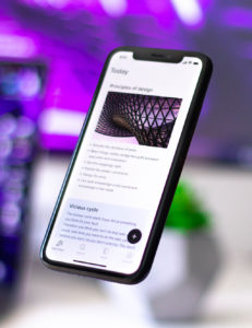
Since your recipients are increasingly checking their email on mobile devices, it makes sense to design your emails first for mobile devices. According to eye-tracking studies, the top-left section is where readers are drawn.
(Unfortunately, the eye tracking study is no longer available at www.usability.gov/tags/eye-tracking/index.html, this url now points to the topic of usability here https://digital.gov/topics/usability/)

Photo by Walling on Unsplash
Responsive Email Templates Are Best For Mobile Devices
What does this mean for your mobile emails? While most email marketing services do, you want to make sure the service that you’re using offers templates that are responsive. Responsive design means that your email content arrangement shifts based on the device being used to view it. This means that if your email is being read on a smartphone, tablet, laptop, or desktop that the content will shift to display well for the size of the screen. For example, on a smartphone two-column layouts are rearranged into one, and with responsive templates, you’re all set: the column on the left will stack on top of the column on the right. This also means that if you’ve got something important to say, place it there so it’s seen first.
Designing for the smallest screen gives your content its best opportunity to be read. If your email marketing provider has a built-in mobile preview feature, that makes it easy to consider your mobile readers while adding and arranging your content and to make sure that your main message is at the top-left, can’t-miss section. Even better, test on a variety of devices themselves to better understand your customers’ experience viewing, scrolling and clicking.
For more help with designing your emails to work well for all devices, be sure to also check these tips for mobile-friendly campaigns and designing visually effective email campaigns.
Would you like help with your email marketing your strategy? Or could you use assistance with sending those emails too? Contact Debbie and see how she can help you get better results from your email marketing.